Colour Choices Make a Difference
When investing in new signage it is all about creating attention and impact, and colour is one of the most powerful and adaptable tools to portray your message effectively.
But choosing the correct hues, shades and combinations to catch the eyes of your potential customers, and delivering your message in the right way is much more than simply finding the brightest and boldest colour combinations. Finding the right colour solutions, that are both appropriate and engaging for the target audience and create the correct subconscious image for your brand can be more challenging than you initially thought. Knowing how different groups perceive and react to various colours is an essential part of creating quality designs and can either enhance or destroy the message you are trying to get across.
Why do colour combinations matter?
Being Visible
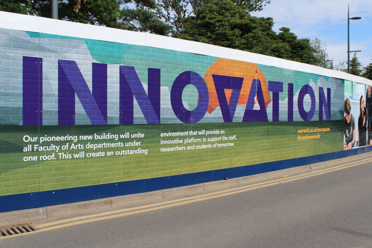
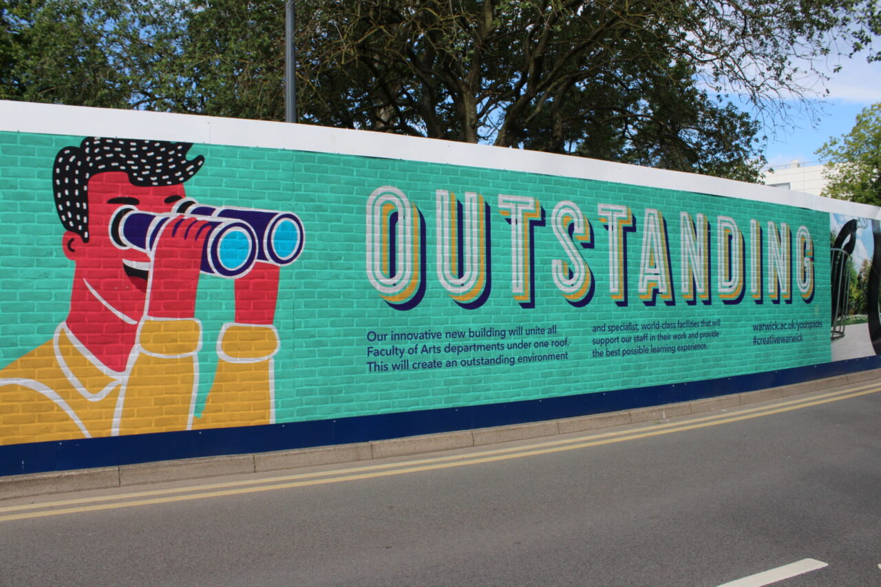
The right colour combination on external signage can not only help you stand out from the crowd, but it can also start your customer journey long before they step foot into your premises or make contact with your team. Understanding that each colour, and combination of colours can elicit an emotional response with your target audience, as well as ensuring that you stand out amongst the crowd can give your business the boost you’re looking for when investing in new signage.
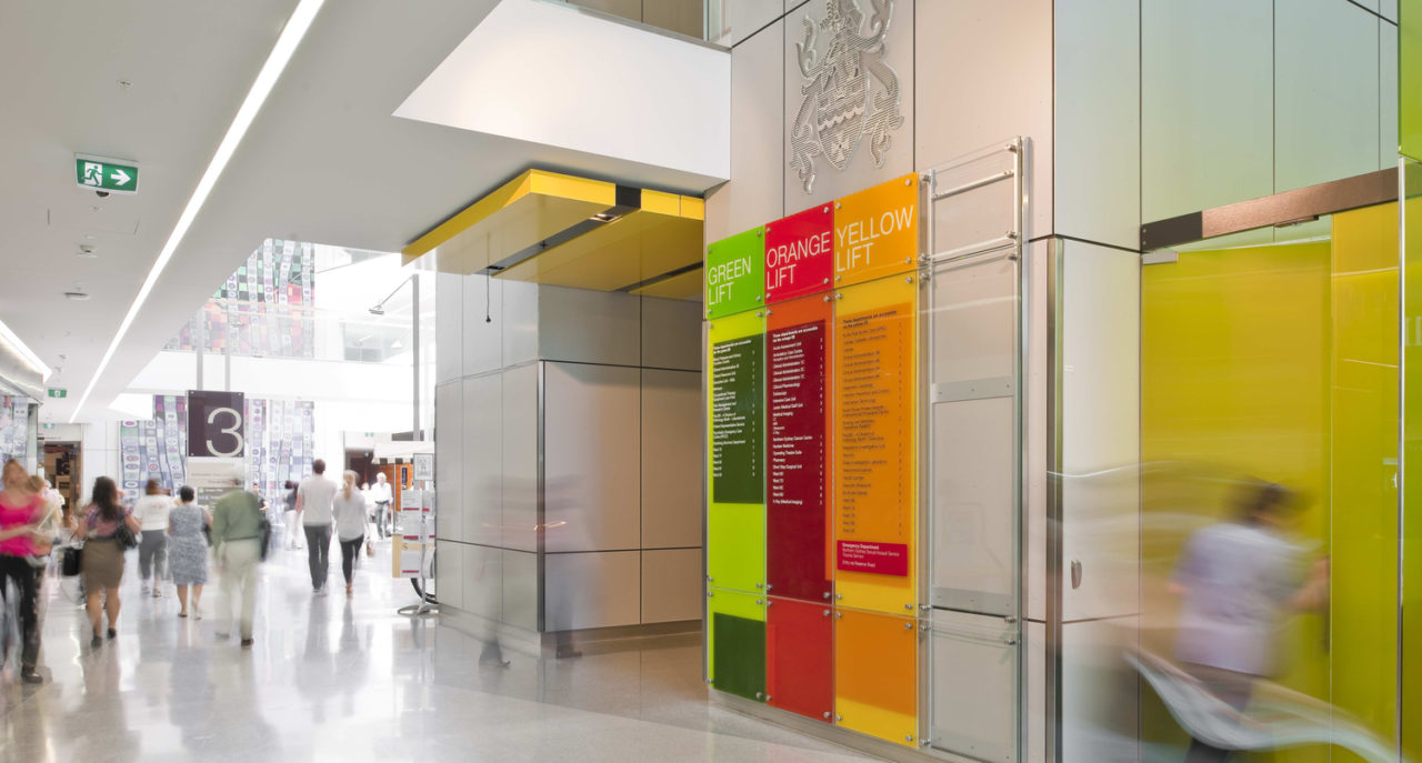
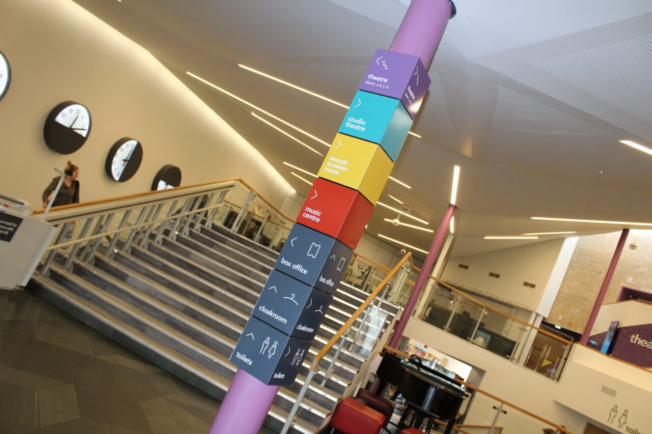
Enhance the Customer Journey
Designing external signage to be noticed can be relatively simple…vivid colours, large brand messages, and high contrast, but designing signage for other areas of your business, such as internal signs, ones that can enhance your customer/client/employee journey, can be a wholly more complicated process.
From wayfinding signs that need to be welcoming, yet informative and highly visible from a distance, to the use of uplifting imagery and universally recognised colours and graphics, the use of colour can have a huge impact on how effective your signs are, how much they’re noticed and ultimately how they affect the experience of the people within your building.
How to Get it Right With Colour Theory…
You may already have an established brand colour palette that you use within your website or your marketing literature. This would hopefully have considered emotive feelings, contrast, and visibility as key considerations. If so, choosing the right blend of these colours for your next sign investment can be as simple as mocking up designs from your current selection of brand colours, However, if these considerations have not been made, here are some quick guidelines to help you decide on your colour palette for your next sign design:
Warm vs Cool Colours
Colours can often be grouped into warm and cool: red, orange, and yellow being synonymous with warmth, while green, blue, and purple are universally accepted as bringing about more cool feelings. Warm versus cool is especially important to be aware of when using colour theory to design your signage and typify your brand experience.
With colour theory, each colour can create natural emotive feelings. For example, red can be seen as creating urgency, or symbolising danger. It is important to not only choose your colours based on how you’d like your signage to be seen, but also the emotions it could create. Ie. A helpful, friendly sign that contains a welcoming message but utilises bold reds against a contrasting clear white background and large typefaces is likely to deliver a conflicting message to whoever reads it.
Balancing your schemes
Monochromatic colour schemes in which you use varying shades of a single colour to deliver a clear, concise message, providing a harmonious feel to your signage design. They’re simple, and they look cohesive and well put together. However, they can often lack contrast, making them difficult to decipher from a distance. Ensuring you balance your choices effectively can help to make sure that none of your shades are too similar looking and your signage is clearly visible in the environment you need it.
Analogous colour schemes are made up of colours that are similar in hue and appear next to each other on the colour wheel, such as using red, orange, and yellow together. These types of colour schemes are simple to work with and deliver a visually pleasing finish without being too complex. To ensure that your brand message comes across smoothly without causing confusion it is always useful to consider the mixing of warm and cool colours, that can often look aesthetically pleasing, but cause emotive confusion about a brand.
Complementary colour schemes take advantage of natural; colour combinations that feel balanced. You are likely naturally already aware of many of these colour combinations, often consisting of colours that are directly across from each other on the colour wheel. With natural balance, they can deliver natural contrast and balance without over complication. With such high contrast, it is often a good idea to ensure you have simple rules in place to avoid overwhelming the design. Choosing one primary colour and using a secondary for accents and highlights is a great way to deliver visibility, natural contrast, and effective design.
In summary, colour choices can be crucial to creating effective, memorable, or useful signs, both externally and internally. Ensuring that your design delivers on your needs means that colour combinations and brand messaging needs careful consideration.
The expert team at Graphic Arts Group have been supporting clients with signage design for many years, harnessing the creative power of our design team, the craftmanship of our skilled sign makers, and the detailed expertise of our highly experienced installers, to deliver top quality signage solutions to multiple sectors UK-wide.
We work with main contractors, facilities managers, architects, and design agencies to design, manufacture and install signage and wayfinding solutions that meet the most exacting standards – all custom made. Our dedicated team has many years’ experience in design and manufacture from custom fabricated building signs through to temporary hoardings and banners.
To explore more about how Graphic Arts Group can help with your environment branding needs, visit our website or contact one of our experts for a chat today- [email protected]